Wednesday, October 1, 2014

Hearts and Flowers

Hearts and Flowers an original oil painting by Joan Terrell
Hearts and Flowers    © 2014 Joan T. Terrell
An original oil painting on panel with black 3/4" cradled sides that act as a frame, but could be put into a traditional type of frame if desired
6"H x 6"W

Do you want to re-paint every single artwork you've done? I do. The first go around was OK, but didn't seem to have the joie de vivre that my friend, Katie (the bride, in case you hadn't guessed) emanates. Wonder if you recognize this painting from its first version in this post from May named Spring Trio (hint, it's the one on the left).

After taking another look at the photo, turning it this way and that, I had a flat forehead moment. There were hearts everywhere... my favorite thing to embed subliminally in my paintings. Even  her wedding gown bodice was forming a heart. Here's a look at the colorful acrylic block-in stage, pointing out just a few of the heart shapes.

Hearts and Flowers colorful acrylic block-in pointing out heart shapes

I got so wrapped up in this one that I forgot to take step-by step photos, so here's a look at the final again. Notice the lacey squgglies around the bouquet? That's an Italian art technique called sgraffito. It means "to scratch" and is used to score into wet paint to reveal the dry layer of color beneath.

Hearts and Flowers an original oil painting by Joan Terrell

Here are some of the details. Are there additional hearts and flowers revealed in the sgraffito? You betcha. Can't have too many, you know.


A famous piece of music titled Hearts and Flowers was written by Theodore Moses Tobani in 1893 and is used frequently as mood music for dramatic scenes in silent films. You'd recognize it if you heard it. And isn't that what love, marriage, and baby carriages are all about? Ah, life. 

Friday, September 12, 2014

Gimme Shelter

"Oh, a storm is threat'ning my very life today if I don't get some shelter oh yeah, I'm gonna fade away..." - from Gimme Shelter by The Rolling Stones (written by Mick Jagger and Keith Richards)
Yesterday, September 11, was the first annual Paint the Town plein air event at Flowery Branch, Georgia. My artist friend, Patricia Fabian, and I met on Main Street. Flowery Branch is a charming town with colorful storefronts that remind me of Curacao. Wisely, Patricia had parked and set up in the shade of one of the large oak trees that line the downtown streets. It was a hot, muggy day with threat of storms. Sometimes the location of shade provides the inspiration when painting en plein air.

I parked in front of her and found a scene of what could have been a pantry for an old southern home. It was attached to the house, so I don't think it was the kitchen, which usually was built outdoors so the heat and threat of fire was kept outside. Everything old is new again, huh?

Wish I had taken a reference photo to show you, especially of the huge wasp nest hanging in the overshadowing magnolia tree next to the bump out. It was so big that some city maintenance employees drove by to make sure I knew the nest was there. It was still an active nest, so I steered clear and set up out of its way. As the temperature rises, so does the ornery temperament of hornets until, at the end of August/early September, they are spoiling for a fight. It was a little smaller than the one we found hanging from our satellite dish recently. Yikes!


huge hornet's nest

Here's the first take using colorful, straight out of the tube, acrylics and Liquitex® glazing medium. Glazing medium works a lot better than water. Just a touch goes a long way and gives acrylics that clear, stained glass look. Don't know if there's a method to my madness, but I seem to be trying to establish a three tone value pattern with yellow showing where the sun would shine when it wasn't behind a cloud, magenta being the darkest area, and green being sort of a middle tone (although I wish I had brought a pretty blue with me instead). Following the 'fat over lean' principle, I'll finish the painting with oils.

colorful block in of original painting by Joan Terrell

After a hard morning's work, Patricia and I walked to the nearby Common Grounds restaurant. A fellow artist had recommended the grilled cheese sandwich, so that's what we got. This was no ordinary grilled cheese. It was pepper jack on a dark, dark wheat with panini grill marks. Although the bread was whole wheat, it wasn't that annoying "can't bite, can't chew, and it's so healthy it falls apart in my hands" type. It was more like a dark rye.

artists' lunch at Common Grounds in Flowery Branch, Georgia

The path back to our easels took us right past a hand made right there on the spot gourmet chocolate shop. Imagine that! The dark chocolate mango filled hit the spot. Patricia left to check on her dog, Miko, which had just had surgery the day before, but I really liked the start she had gotten on her painting. So talented. I headed by to my hornet city easel. I tell you it was hot. So very hot, and humid, and not even the slightest of breezes. Not even the occasional, "I feel so sorry for you humans down there" type of breeze. Nada. Not a thing. I set up my easel in the shade with my subject matter around the corner where I could take an occasional peek and commenced to painting fast, because there were only three hours left before having to turn our artwork in for judging.

Here's how the final turned out, along with it's info sheet for the judges. It's name is Shelter because it safeguarded the family's pantry goods and because the magnolia tree beside it gave it shelter from the elements like loving arms.

Shelter, a colorful original oil painting by Joan Terrell
Shelter      © 2014 Joan T. Terrell
An original oil painting on panel with black 3/4" cradled sides that act as a frame, but could be put into a traditional type of frame if desired
Painted en plein air at Main & Mitchell streets in Flowery Branch, Georgia
14"H x 11"W

The rest of the lyrics for Gimme Shelter talk about war and general maladies, which adds another layer to this plein air adventure. Yesterday was September 11 and because of those hot-headed nasty hornets, I am praying for cooler weather. Not only for north Georgia, but for all of the hot spots of the world. May cooler heads soon prevail.

Getting outside and painting gives me shelter from the news about wars and rumors of war. Until next time, get up, get out, and get lost in doing something fun!

Thursday, August 28, 2014

Color and icing and pattern, oh my!

colorful oil painting by Joan Terrell titled My Big Fat Fauve Cupcake
My Big Fat Fauve Cupcake
An original oil painting by Joan Terrell
Dimensions: 6" x 6" x 1/8"D on gessobord™ panel
Unframed
© 2014 Joan T. Terrell

One down, one to go of this colorful, fauvist cupcake. Layered on the icing using a palette knife.

using a palette knife to layer on the oil paint for My Big Fat Fauve Cupcake

Hungry this morning and wishing that was real icing instead of oil paint. Used Rembrandt Cadmium Yellow Lemon straight out of the tube for this accent. Look at all that luscious "icing".

I'm signed up for Leslie Saeta's palette knife workshop in October and can't wait. Leslie's the genius behind Artists Helping Artists Blog Radio (see link over to the right).

Here are some closeups of the finished painting. Visit past blogs to see step-by-step photos.

closeup of main part of cupcake oil painting by Joan Terrell

Washing the paint and solvents off of palette knives is sure easier than wiping and washing brushes. I love the heavy texture this technique adds to my paintings, too.

closeup of patterns in cupcake oil painting by Joan Terrell

Really enjoyed painting the illusion of the intricate pattern. Love the illusion of impressionism. Hopefully just enough suggestion so your mind fills in the rest.

closeup of pattern in fauvist oil painting by Joan Terrell, including signature

Signed by yours truly. Signing is difficult. More on that in a future post. Looking for tips and tricks. Got any? Be sure to let me know by adding a comment to this post.

Later, cupcake!


Monday, August 25, 2014

Keep going, and going, and going...

I love the swirl and twirl of life and being in the rhythm. There are four paintings on the easels right now and working on them in various stages on different days helps clear my mind. While one or two are cooling off, others are heating up. Two of my French easels were garage sale finds, one is from the Tuesday Morning store and one is from a friend's teenage daughter who never used it and went twirling off with another glittering interest of the minute. Life is like that. It's the natural ebb and flow of the endless tide.

Life is also like this sometimes:

RIP Brushes

Last week an 18-wheeler decided he wanted my lane. Thank goodness I had a way out. It was hi-ho silver pine and up over the curb into the landscaping at a doughnut shop. Not knowing he had crunched me, the 18-wheeler kept on going. Thank goodness for the kind people of Athens, Georgia who phoned the police. The 18-wheeler was pulled over down the road and its info is now part of the accident report.

Amazingly, I am fine, except for a small gash on my left forearm that we're keeping an eye on and a purse full of glass from the two side windows imploding. It could have been worse, a lot worse, and believe me, I am giving thanks every day!

Now it's back to having fun with these two fauve cupcakes. Here's where to find their history and progress steps. Just a little more baking and they'll be done. I love this "putting the icing on the cake" stage. OK, ok, enough with the analogies, but I couldn't resist!

Almost finished

Until next time, let's just keep putting one foot in front of the other and dance the dance. Later, cupcake!


Monday, August 11, 2014

Backwards and in heels

If anyone had told me an artist could be this busy, I wouldn't have believed them. I feel like Ginger Rogers, dancing and twirling through the rushing days. Remember that saying? Fred Astaire could really dance, but Ginger could dance, too... backwards and in heels!


Until next time, enjoy these Astaire/Rogers clips and let's get up and get to it! Here's the secret: Go and keep going! 

Thursday, August 7, 2014

My big, fat fauve cupcake

I brought this beautiful cupcake home and set it up in the studio. As my assistant, Bella Z. Ball, suggested in Monday's post, a colorful napkin was added because the fauve artists were not only fond of bright colors, but plenty of patterns. Then I got to thinking... a big, fat fauve cupcake is a terrible thing to waste, so I took a photo of it and then struck that setup and changed the napkin to a teal stripe. I held up another napkin behind it that complements the stripe and imagined it was wallpaper.


I taped both of the 6" x 6" gessobord™ panels to a piece of cardboard, decided to do "2 up", and off we go. As you can see, I toned the panel on the left with Gamblin Transparent Orange. I used to tone all my canvases this way. First, it gets rid of the "fear of the white, blank canvas", secondly, it provides a midtone, so I can work with the darks and lights better (in theory anyway), and thirdly, I think it provides a warm surface for light to bounce off of, even when it's covered with paint. I painted over the pencil lines with thinned magenta.


To tone a canvas or panel, thin a little transparent type oil paint - such as Transparent Orange or Permanent Rose, etc. - with some mineral spirits - which I call "turps" - and brush on. It's somewhat runny and best done outside because of the fumes - even if using odorless mineral spirits. Don't make the mistake I did and tone a lot of canvases inside because the fumes were overwhelming and I'm glad I didn't blow up the house!


I save the plastic inserts from Nonni's™ biscotti. Their ridges make the best brush washing, gessoing, and toning mixture trays ever. Of course, I had to gain a pound or two in the process. What we have to sacrifice for our art!

Being new to choosing and mixing patterns, I did some homework. First, I visited some "how to mix patterns like a pro" sites (like this one), which explained the basics, and then it was off to the store. First, I visited Pier I. Being a thrift hunter, I scoped out their clearance section of orphaned napkins. Pier I is really good about having complementary patterns in their napkin section, so being new to this, I left it up to the pros. I also got some solids because it's hard to let go of my traditional safety raft.


After being inspired by Pier I, I visited the clearance remnants at Hancock Fabrics. So much fun walking around and trying to find crazy, complementary patterns! They have a lot of potential to be used as inspiration for wall paper, tablecloths, chair upholstery, anything you can imagine, in future paintings. It really flipped me over to right brain mode to just think of colors and patterns. A crazy, fun outing. Even the staff at Hancock got involved as we took samples around the store to the clearance bins without thought of fabric type or practical use. "What about this?" "Hey, this one may pick up some of that purple!".

So with that being said and the two panels being set up and ready, I put on my Enya Memory of Trees CD and got started. Number 1, I love Enya and painting to her music puts me into a good "block in" mood. Number 2, the CD runs for 45 minutes and I'm due to meet Pam for a haircut this morning and don't want to be late. You know how it is when you're flipped over to the right brain... no sense of time. Just color, pattern, and music!

Got to go now and get that haircut. I'm getting my bangs back and am sure she'll use her special "10 years younger" scissors. It'll be refreshing to go to a shorter style in this August heat and humidity.

Later, cupcake!


Monday, August 4, 2014

Hello, Cupcake!

We celebrated birthdays recently and so far successfully dodged the cake and ice cream, but then, while innocently strolling past the baked goods, like a shaft of light from above shining on a glittering treasure, there was the THE ONE. Whoa! Who is that fauvist bakery artist working back there? When I put the glorious cupcake in the hand cart, its colors outshone all the healthy items. Gone was the healthy broccoli and cauliflower mix, along with the organically grown zucchini and the Suddenly Salad™ pasta mix.


brightly colored cupcake

After carefully hiding it from my husband (wrapped in a plain brown wrapper and stuck in the back of the fridge and then camouflaged with the healthy vegetables in front of it), I stealthily removed it early one morning and carried it to my studio to paint. However, my assistant, Bella Z. Ball, enters stage right.


Bella sneaking up on cupcake
H-mmm, what's that I smell. Is it the turps? 


Bella getting closer to cupcake
While she's distracted at the computer, I'll just move around this pesky easel thingy.

Bella caught near cupcake
 Oh yeah, that's definitely for me because I just turned 3. What, huh? Oh, I was just thinking how nicely a wild patterned napkin would go with this crazy thing. Seriously, that's all.

colorful cupcake with patterned napkin and plate

Good idea, Bella! 

Thursday, July 31, 2014

Circle of Love, finished


Circle of Love      © 2014 Joan T. Terrell
Original oil painting on cradled gessoboard™
6" x 6" x 1.5"D

Here is the finished oil painting of Leslie's colorful bridal bouquet. Can't wait to deliver it to her. Added the bling in the middle of the bouquet by using a few sparkles that were made especially to be mixed with paint. See the bling brooch in the middle of the bouquet and in the center of about five flowers? Have tried to show the detail below. Wish the camera would capture that bling!

Now I've got to walk down the aisle toward my easel. Have about three more paintings in various stages that I want to share with you soon. Until then, think loving thoughts! Later.

See step-by-step photos here.

Monday, July 28, 2014

Like Paris, only different

A cool front came to Georgia recently and when I logged onto my computer, I was surprised to find that the near-by city of Hoschton was the same temperature as Paris. Ah, Paree, how I loved visiting there. I never understood falling in love with a city until then. 


Paris, France and Hoschton, GA temperatures both 72

So I drifted into Hoschton, to re-visit a restaurant that has plenty of Franco oomph going for it.  


downtown Hoschton, GA

As mentioned in a recent blog post, my husband and I discovered a charming restaurant with gourmet food, right there in downtown Hoschton. The restaurant's name is One Blue Duck. Here are a couple of comfy chairs for us while we're waiting for a table. Chardonnay, mon cher?


Two blue chairs in One Blue Duck

We're lucky to get the "red chair" corner table. From this vantage point, we can almost see the entire restaurant, yet it's cozy. 

Red chair by window in One Blue Duck

Remember the movie, Midnight in Paris? I feel like we're in the way-back machine and can almost hear a chanteuse in the background. You remembered to bring your flapper beads, right?


Brick inside One Blue Duck showing date of 1924

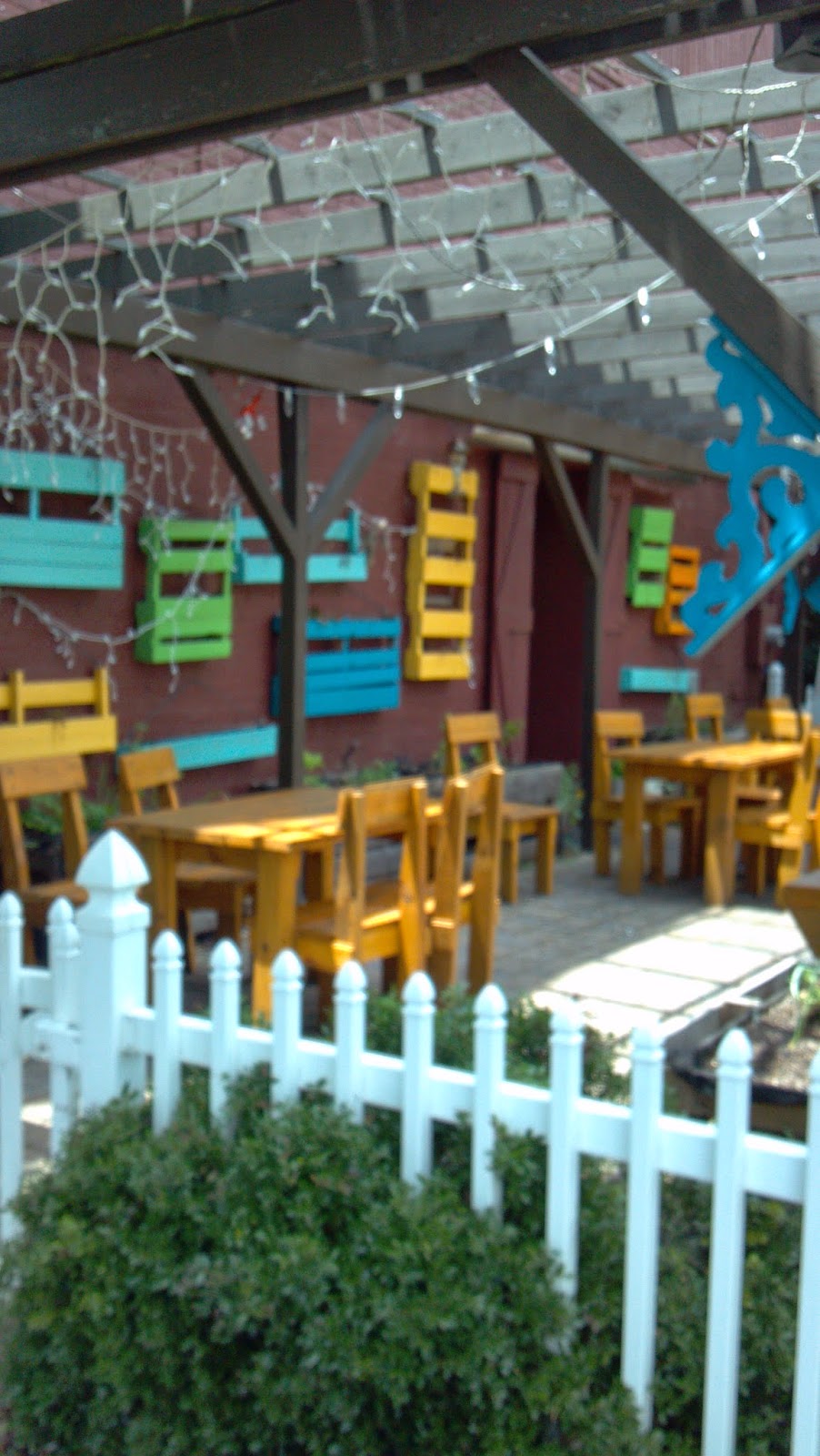
Wandering around the outside patio area after duck confit, I think how I'd love to see those lights hanging from the pergola sparkle at night.
One blue Duck colorful patio

Until then, we can just watch the clouds drift by.

Looking at clouds at One Blue Duck


What a nice surprise to find Paris right here in Georgia. Will one or more paintings be inspired by our lovely afternoon? Mais oui!

Thursday, July 24, 2014

Circle of Love, progress steps

Remember this bridal bouquet painting from a previous post? It was done as a speculation project for a wedding event coordinator and she had borrowed the photo from her co-worker. She's keeping the painting on her desk to help me start a new art offering, A Brush With Romance® Thanks, Liz.


When I found out the bouquet actually belonged to her friend and co-worker, Leslie, I knew it was back to the easel so Leslie could have a memento from her wedding on her desk as well. Using another photo from the wedding, I sketched the bouquet onto a 6" x 6" x 1.5" deep board. This time I painted the 1.5" deep cradled sides black because a darker color would help frame the painting better. I made my lines fairly heavy because I didn't want to lose them when the washes and glazes started.


You can see a hint of the two love birds kissing at the top of the painting. Sometimes the title for a painting comes to mind first. Well, usually the title comes first. See the yin/yang effect of the color washes below and how the couple's arms circle around beneath and behind the bouquet? The thing about using reference photos is that a good photo is low contrast and that's what professional photos are... low contrast. However, most successful paintings require a high contrast, so I had to invent my own contrast with this painting. The light will come in from the left and the shadow or darkest side will be on the right. The yin/yang effect is where light and dark meet in the middle of the bouquet.


Here's a photo of how it's starting to look. First, I went over the lines with magenta (love it when a little magenta peeks out around the edges) and then began the block-in, starting with the groom's coat. Typically, an oil painting starts building up from darks to lights. It's important to paint all over the canvas to create color harmony and blended strokes, so don't just concentrate on one small area and then another. Loosen up, hold the brush by the end, say en garde and work from the shoulder instead of from the wrist. It helps to have your favorite music playing in the background, too. This was painted to Diana Krall via Slacker internet radio's classic jazz station.


While looking at the reference photo, I noticed something that escaped me the first time I painted this bouquet. Leslie blinged her bouquet! There's a beautiful sparkly silver brooch in the middle and some of the flowers have blazes in their centers. Don't know how I'm going to capture that, but let's give it a whirl!

Stay tuned to "how the bouquet turns".

Monday, July 21, 2014

Somewhere over the rainbow


Artists are always trying different paint colors and brands. Sometimes before beginning a painting, I do a paint test. This test can create some interesting results on both the palette and the canvas.

This test is on a sheet of 16" x 20" canvas, but 140 lb. water color paper or maybe even foam core board would work just as well. Love those pads of canvas for experimenting. You can just tear out a sheet and experiment, then if you like the results, glue it to a board. Most artists use Masonite cut to size for the backing board. Home Depot can be your friend.


I decided which paints to test and then wrote their names along the side and top. I also wrote the brand names down in the lower right corner. Here's what I used: Cadmium Yellow Light, Cadmium Orange, Alizarin Crimson, Cadmium Red Light, Sennelier Blue Grey, Cerulean Blue (don't you just love how the word "Cerulean" rolls off your tongue?), and lastly, good old tried and true favorite, Ultramarine Blue. All are the Grumbacher Pre-Tested brand except for Sennelier (ah, the French, there's another one that rolls off the tongue - "Oui garcon, I'd like another Sen-el-yay, please." They love our Southern accent over there).

Then I squeezed a little of each color down the side and along the top. This baselines the pure "out of the tube" color. Oh, and white. After mixing, you want to use a little white. Almost forgot, that's like saying - "don't forget to add pecans to that pie".

I started with the yellow and then moving across, mixed the yellow with each color. I used a palette knife because it's easier to clean than a brush and it helps maintain a purer color mix. 

So why do this? The answer is color harmony. There are a lot of colors out there, but if you keep your palette limited, the odds are in your favor for smooth sailing.

Ooooh, did you see what Alizarin Crimson and Sennelier Blue Grey made? Now we're dancing!

Follow the yellow brick road...


Thursday, July 17, 2014

Atomic Cocktail, cheers to ya!

Atomic Cocktail      © 2014 Joan Terrell, artist
Original oil painting on 6" x 6" gessobord™

Not framed

Here's the finished painting inspired by my Lexington adventures and I loved working on it. Below is a photo of the "sorta kinda finished" one so you can see the changes I made after signing it. So spank my hand with a #10 flat for doing that. Found the "vivid" setting on my camera so the photo above looks more like the actual painting. I've only had that camera for 5 years, and maybe it's time to read the user guide. (Ironic, no, since I write user guides? Ha!) 


The pink in the cocktail seemed to be competing with the pink in the umbrella, so I glazed the cocktail with a thin mixture of Naples Yellow. Hopefully, this makes the pink umbrella "pop" more. Then I turned the umbrella from red to pink. Here's a link to the blog containing the step-by-step photos.  

Later, and ya'll stay cool!

Monday, July 14, 2014

Happy Birthday

June was a busy month and not much painting going on what with the trips to Lexington and the beach. We had a good time during Larry's birthday and loved the new restaurant we tried for the first time. It's called One Blue Duck and is in downtown Hoschton. It has good ambiance and is in an old building with exposed brick on the inside. One of the bricks had 1924 stamped into it. We finished with coffee and a delightful creme brulee with fresh fruit.


Lots of presents for him. Wait, that one on the left's not for Larry.


Happy Birthday to Bella, too. We don't know her exact birth date, so we combined it with Larry's. Bella turned 3 this year and Larry turned, well, let's just say he remembers black and white TV.


As you can see, Bella is absolutely thrilled with "Mr. Chuckles", as we call him. 

Where's the bacon cake and Frosty Paws ice cream?

So Happy Birthday to Larry and Bella and many happy returns. You know what they say... Birthdays creep up on you faster than cheap underwear!