Thursday, July 31, 2014

Circle of Love, finished


Circle of Love      © 2014 Joan T. Terrell
Original oil painting on cradled gessoboard™
6" x 6" x 1.5"D

Here is the finished oil painting of Leslie's colorful bridal bouquet. Can't wait to deliver it to her. Added the bling in the middle of the bouquet by using a few sparkles that were made especially to be mixed with paint. See the bling brooch in the middle of the bouquet and in the center of about five flowers? Have tried to show the detail below. Wish the camera would capture that bling!

Now I've got to walk down the aisle toward my easel. Have about three more paintings in various stages that I want to share with you soon. Until then, think loving thoughts! Later.

See step-by-step photos here.

Monday, July 28, 2014

Like Paris, only different

A cool front came to Georgia recently and when I logged onto my computer, I was surprised to find that the near-by city of Hoschton was the same temperature as Paris. Ah, Paree, how I loved visiting there. I never understood falling in love with a city until then. 


Paris, France and Hoschton, GA temperatures both 72

So I drifted into Hoschton, to re-visit a restaurant that has plenty of Franco oomph going for it.  


downtown Hoschton, GA

As mentioned in a recent blog post, my husband and I discovered a charming restaurant with gourmet food, right there in downtown Hoschton. The restaurant's name is One Blue Duck. Here are a couple of comfy chairs for us while we're waiting for a table. Chardonnay, mon cher?


Two blue chairs in One Blue Duck

We're lucky to get the "red chair" corner table. From this vantage point, we can almost see the entire restaurant, yet it's cozy. 

Red chair by window in One Blue Duck

Remember the movie, Midnight in Paris? I feel like we're in the way-back machine and can almost hear a chanteuse in the background. You remembered to bring your flapper beads, right?


Brick inside One Blue Duck showing date of 1924

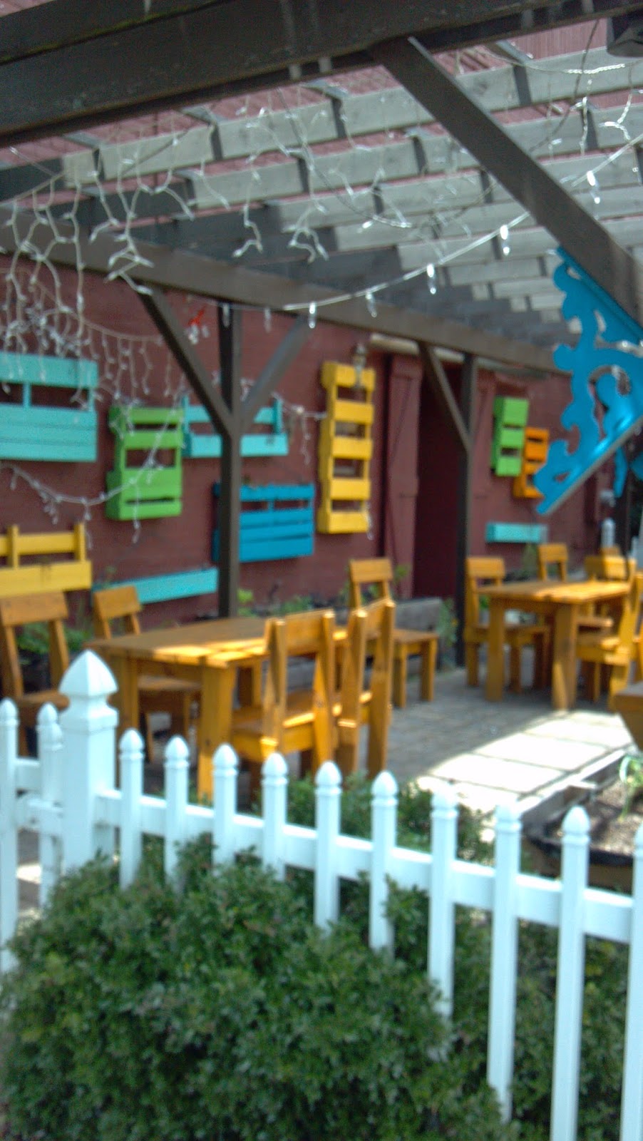
Wandering around the outside patio area after duck confit, I think how I'd love to see those lights hanging from the pergola sparkle at night.
One blue Duck colorful patio

Until then, we can just watch the clouds drift by.

Looking at clouds at One Blue Duck


What a nice surprise to find Paris right here in Georgia. Will one or more paintings be inspired by our lovely afternoon? Mais oui!

Thursday, July 24, 2014

Circle of Love, progress steps

Remember this bridal bouquet painting from a previous post? It was done as a speculation project for a wedding event coordinator and she had borrowed the photo from her co-worker. She's keeping the painting on her desk to help me start a new art offering, A Brush With Romance® Thanks, Liz.


When I found out the bouquet actually belonged to her friend and co-worker, Leslie, I knew it was back to the easel so Leslie could have a memento from her wedding on her desk as well. Using another photo from the wedding, I sketched the bouquet onto a 6" x 6" x 1.5" deep board. This time I painted the 1.5" deep cradled sides black because a darker color would help frame the painting better. I made my lines fairly heavy because I didn't want to lose them when the washes and glazes started.


You can see a hint of the two love birds kissing at the top of the painting. Sometimes the title for a painting comes to mind first. Well, usually the title comes first. See the yin/yang effect of the color washes below and how the couple's arms circle around beneath and behind the bouquet? The thing about using reference photos is that a good photo is low contrast and that's what professional photos are... low contrast. However, most successful paintings require a high contrast, so I had to invent my own contrast with this painting. The light will come in from the left and the shadow or darkest side will be on the right. The yin/yang effect is where light and dark meet in the middle of the bouquet.


Here's a photo of how it's starting to look. First, I went over the lines with magenta (love it when a little magenta peeks out around the edges) and then began the block-in, starting with the groom's coat. Typically, an oil painting starts building up from darks to lights. It's important to paint all over the canvas to create color harmony and blended strokes, so don't just concentrate on one small area and then another. Loosen up, hold the brush by the end, say en garde and work from the shoulder instead of from the wrist. It helps to have your favorite music playing in the background, too. This was painted to Diana Krall via Slacker internet radio's classic jazz station.


While looking at the reference photo, I noticed something that escaped me the first time I painted this bouquet. Leslie blinged her bouquet! There's a beautiful sparkly silver brooch in the middle and some of the flowers have blazes in their centers. Don't know how I'm going to capture that, but let's give it a whirl!

Stay tuned to "how the bouquet turns".

Monday, July 21, 2014

Somewhere over the rainbow


Artists are always trying different paint colors and brands. Sometimes before beginning a painting, I do a paint test. This test can create some interesting results on both the palette and the canvas.

This test is on a sheet of 16" x 20" canvas, but 140 lb. water color paper or maybe even foam core board would work just as well. Love those pads of canvas for experimenting. You can just tear out a sheet and experiment, then if you like the results, glue it to a board. Most artists use Masonite cut to size for the backing board. Home Depot can be your friend.


I decided which paints to test and then wrote their names along the side and top. I also wrote the brand names down in the lower right corner. Here's what I used: Cadmium Yellow Light, Cadmium Orange, Alizarin Crimson, Cadmium Red Light, Sennelier Blue Grey, Cerulean Blue (don't you just love how the word "Cerulean" rolls off your tongue?), and lastly, good old tried and true favorite, Ultramarine Blue. All are the Grumbacher Pre-Tested brand except for Sennelier (ah, the French, there's another one that rolls off the tongue - "Oui garcon, I'd like another Sen-el-yay, please." They love our Southern accent over there).

Then I squeezed a little of each color down the side and along the top. This baselines the pure "out of the tube" color. Oh, and white. After mixing, you want to use a little white. Almost forgot, that's like saying - "don't forget to add pecans to that pie".

I started with the yellow and then moving across, mixed the yellow with each color. I used a palette knife because it's easier to clean than a brush and it helps maintain a purer color mix. 

So why do this? The answer is color harmony. There are a lot of colors out there, but if you keep your palette limited, the odds are in your favor for smooth sailing.

Ooooh, did you see what Alizarin Crimson and Sennelier Blue Grey made? Now we're dancing!

Follow the yellow brick road...


Thursday, July 17, 2014

Atomic Cocktail, cheers to ya!

Atomic Cocktail      © 2014 Joan Terrell, artist
Original oil painting on 6" x 6" gessobord™

Not framed

Here's the finished painting inspired by my Lexington adventures and I loved working on it. Below is a photo of the "sorta kinda finished" one so you can see the changes I made after signing it. So spank my hand with a #10 flat for doing that. Found the "vivid" setting on my camera so the photo above looks more like the actual painting. I've only had that camera for 5 years, and maybe it's time to read the user guide. (Ironic, no, since I write user guides? Ha!) 


The pink in the cocktail seemed to be competing with the pink in the umbrella, so I glazed the cocktail with a thin mixture of Naples Yellow. Hopefully, this makes the pink umbrella "pop" more. Then I turned the umbrella from red to pink. Here's a link to the blog containing the step-by-step photos.  

Later, and ya'll stay cool!

Monday, July 14, 2014

Happy Birthday

June was a busy month and not much painting going on what with the trips to Lexington and the beach. We had a good time during Larry's birthday and loved the new restaurant we tried for the first time. It's called One Blue Duck and is in downtown Hoschton. It has good ambiance and is in an old building with exposed brick on the inside. One of the bricks had 1924 stamped into it. We finished with coffee and a delightful creme brulee with fresh fruit.


Lots of presents for him. Wait, that one on the left's not for Larry.


Happy Birthday to Bella, too. We don't know her exact birth date, so we combined it with Larry's. Bella turned 3 this year and Larry turned, well, let's just say he remembers black and white TV.


As you can see, Bella is absolutely thrilled with "Mr. Chuckles", as we call him. 

Where's the bacon cake and Frosty Paws ice cream?

So Happy Birthday to Larry and Bella and many happy returns. You know what they say... Birthdays creep up on you faster than cheap underwear!


Friday, July 11, 2014

Nothing to Beach About, the painting


Nothing to Beach About     © 2014 Joan T. Terrell, artist
Original oil painting on 6" x 6" gessobord® panel
Unframed

I liked the photo of the Piedmont Girls near Myrtle Beach and decided to turn it into a painting.

I shifted the composition slightly so the yellow umbrella wouldn't be smack dab in the middle. Here's the pencil sketch. Have you ever noticed how some times the ocean looks like the sky and vice versa? It's usually windy at the beach (read "a bad hair day every day" here) and I wanted to emphasize the wind blowing. We had worked really hard at anchoring that umbrella and it wasn't going anywhere. Our towels and sunglasses, though, that's another story!


Here's the colorful under painting. I used magenta in the foreground because I knew the sea grass would be mainly dark green and wanted some of that brightness stepping out between brush strokes. Red and green are opposites (complementary colors) on the color wheel, so they help each other "pop" when used together. Well, not when mixed together. When opposites are mixed together, nice rich gray/brown neutrals occur. I  turned the blue towel blowing from the back of the chair to a red one because I really like the color red. 


I used a good-sized brush almost throughout the whole painting (a #8 Princeton flat) and united the chair shadows so the chairs wouldn't look like Chiclets® dotting the shoreline.


Here's another look at the final. Maybe I chose this photo because I just treated myself to a luscious tube of Gamblin Thalo Turquoise. H-mmmm, come to think of it, in addition to red, I love blue. I used blue in the under painting of the ocean instead of its opposite (yellow) because I wanted to preserve those glorious blues. If I had glazed or washed blue over the top of a yellow ocean under painting, the color would have been more green. Although greenish is more the color of the Atlantic ocean, I was anxious to try out that turquoise and it didn't disappoint. Same with the umbrella and the sandy beach. Didn't want to risk those turning green. See what I mean? Look at the overstroke between the chairs in the photo above. This happened when the turquoise blue glazed over the yellow sand. No worries. Having the blue water near the yellow umbrella is enough color wheel thinking for a while.


Remember that little tidal pool on the left in the under painting? As kids, we used to love looking for crabs and periwinkles trapped in those pools during tide changes. They were just waiting for high tide to come again and rescue them. It didn't look quite right having a splash of blue there among the rich sandy neutrals and since I didn't want ol' crabby coming out and latching onto one of those toes, decided to remove it.

No worries, high tide is at 10:17 p.m. tonight and it's a full moon. Meet you there! You're bringing the fireworks, right?

Monday, July 7, 2014

Nothing to beach about

One of my favorite jazz cats is Mose Allison. Just back from the Piedmont Girls beach trip near Myrtle Beach. Back at work, but to adapt a title from one of my favorite Mose songs "My mind is on Vacation and My Daydreams Work Overtime". 

Remember growing up in Charlotte, NC and getting into trouble at the Pavilion? Well, the Pavilion is no more, and hopefully we've outgrown the trouble. I thought they had plans to rebuild something there, but now it's just a flat piece of real estate for sale. Here's a photo I took the last year it was standing. Ah the memories of that place and the amusement park next to it. Remember riding The Mouse? Maybe a nostalgia painting is in order.


We had good weather and were right on the beach. Yep, I'm still paranoid about sharks and hate that creepy feeling when something touches my foot in the water, so we'll admire from afar. Pretty strange for a certified Scuba diver, huh? Don't judge now, dahlin', we all have our oddities.


Here are the Piedmont Girls (see previous post about us here) soaking up the rays while I'm on the porch taking this photo. Can't be too careful as sharks have been known to leap out of the water, you know.


Now you understand because this is the beautiful porch I was standing on while taking the previous photo. Plus, it's near the food, wine, and air conditioning!


An afternoon storm's moving in. Time to help bring in the umbrella and chairs. Monday's comin'. Sigh.

Driving back home tomorrow and for a while "Ain't Nothin' Gonna Turn Out Right" (another favorite Mose song), but at least I'll have a good time to remember.


Thursday, July 3, 2014

Atomic Cocktail, work in progress

As mentioned, while in Lexington, KY us girls walked to the Atomic Cafe and while waiting for our husbands to leave Lexington Beerworks, enjoyed some cold drinks and hot conversation. I liked the colors in the drink photo, so decided to do a 6" x 6" painting of it. Here's the original photo. 


I turned the photo black and white so I wouldn't be distracted by the vibrant colors. I'm trying to see only the values - or gray tones - here. I taped both photos up on my easel and did a block-in without worrying about the tones or colors. But in the back of my mind, I couldn't help it. I kept remembering the color wheel (free downloads) and thinking "the opposite of red is green, the opposite of blue is orange", so I guess opposites attract because I got really happy using these bright colors. I think this is becoming my favorite stage in trying out this new method inspired by Karen Mathison Schmidt (her art is amazing).


The acrylics (I used an acrylic glazing medium to keep the colors thin and bright - water would have only thinned and dulled the colors) dried quickly and then, keeping the gray scale values in mind, I started painting with oil paints thinned with Liquin. I only chose a few colors: Cad Yellow Medium, Naples Yellow, Cad Red Light, Permanent Rose, Cobalt Teal, Ultramarine Blue, and a "guest" color, a Modigliani pink  Wouldn't it be great to have a paint color named after you? Terrific Terrell Teal has a nice ring to it. Here's the first go-around with the oils. As you can see, I turned the straw around from the original photo because I didn't want it interfering with the cute little umbrella. On the left is the photo of the first blush oil painting stage turned black and white. On the right is how the painting looks with the colors. Pretty close. I didn't notice the shadow the umbrella was casting until I saw it in black and white.


Keeping the values in mind (it's hard when you see all those colors!), below is a photo which is pretty much sorta kinda how I left it this morning. I think I signed it prematurely, because now I see some things I want to go back and do. OK, true confessions, it doesn't look totally like this anymore because I couldn't resist "touching up". I know, I know. Don't go back and paint after you've signed it, but couldn't resist.

The blues are more vibrant than in this photo, so I've got to work on my camera settings, and do a re-take. I should know better than to sign a painting right away. It needs to peculate for a few days. Think I'll take it upstairs so I can glance at it in passing in a home atmosphere, rather than a studio atmosphere. Can you see the ice cubes pressing up against the inside of the glass? I'm happy with the straw, too.


Anyway, until I thought of Atomic Cocktail for the title, I called it "my current experiment" because that's what every painting is. Holding my breath to see what this one grows up to be!